All Aboard the Elections Express
A data-driven "roadtrip" across a few of May's local elections
Choo choo!! All aboard the Elections Express! Grab a seat, your favorite snacks, and make yourself comfortable, because today we’re going halfway across the country to highlight the most dynamic data-driven trends of last month’s local elections.
2023 may not feel like an election year, but state and local elections have been happening throughout the spring across the nation. These off-year elections are as important now as ever, prompting us to dive back into election returns.
On that note, let’s hit the throttle and get going: our first stop is Austin, Texas.
Austin, TX
Austin’s election, which took place on May 6th, drew increased attention due to two competing pieces of legislation on the ballot: propositions A and B. Both propositions dealt with police oversight legislation. However, although the language used in both propositions varied only slightly, they were designed for very different outcomes.
Prop. A aimed to “deter police misconduct and brutality” by implementing specific methods of strengthening the city's police oversight. Prop B was likewise written to “strengthen police oversight,” but the metrics it included for doing so were loosely defined. The two ballot items also came from different sources: one was proposed by a criminal justice reform group (prop. A), and the other by an action committee funded by the Austin Police Association (prop. B). The two proposals are conflicting in nature, and cannot both be implemented. With two similar yet competing propositions, worries arose that voters might be confused or conflicted by seeing questions with such similar language side-by-side, both trying to accomplish police oversight with very different programs.
On May 6th, Prop. A won by a landslide. Despite worries about voter confusion, the logical choice is, after all, to vote for one proposition and against another. The two propositions are supported by competing groups with competing aims, and only one of them can be implemented. So the logical choice is, after all, to vote for one proposition and against another. We do not know how individual people voted, just how many people voted one way or another within each precinct. Are there any precincts, therefore, where voters chose for on both of them or against on both?
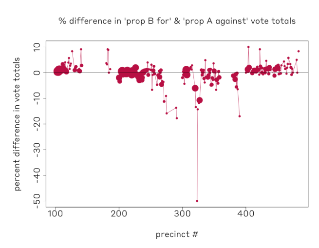
Below is a plot which, on the x-axis, shows each Austin precinct which voted on
these propositions. The y-axis shows the percentage difference between vote totals for “for proposition A” and “against proposition B”. On this axis, we would expect the dots to be clustered around zero, and for the most part this is true. What is interesting, however, are the cases where voters deviated, which we see where these numbers are greater or less than zero.
In the graph, we can see a cluster of precincts which did not vote with a zero vote total difference on these two propositions. The points are sized by how many votes were cast overall in that precinct. Interestingly, these precincts are clustered geographically in wards 2 and 3. We do not have enough information to determine the reason for this mismatch in vote choice, but we could speculate that some voters faced confusion when voting since the propositions were so similar. Yet, the large quantity of voters and precincts who voted differently on the two propositions (the ones clustered around zero on the graph) highlight that communication by voter advocacy groups telling voters to vote differently on these bills was likely effective.
Kentucky
As our train heads north, I hope you are ready for a different horse race. No, not the one you’re thinking of: the race for Secretary of State.
Kentucky’s Republican primary race held a re-match for Secretary of State between incumbent Michael Adams and challenger Stephen Knipper on May 16th. The pair previously ran against one another in the election for Secretary of State four years ago, where Adams defeated Knipper in a landslide.
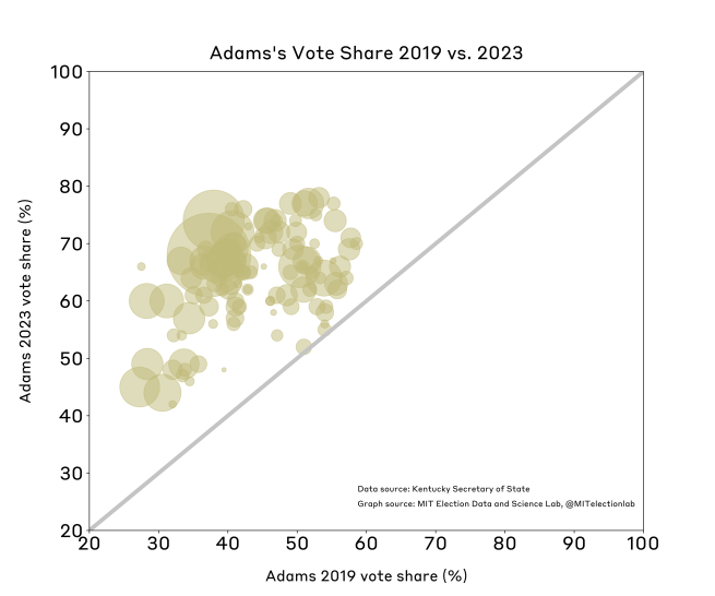
The scatterplot below shows Adams’ vote share in 2019 on the x-axis versus Adams’ vote share during this month’s election for each county; the points are sized by how large the county is. Points that fall above the line y=x are counties in which Adams vote share was greater in 2023 than in 2019, which we can see is all of them. Additionally, the largest dots are furthest away from the line, which means larger counties saw the greatest increases. However, it’s important to bear in mind that Adams now has incumbency advantage in this election, and is competing in a small candidate field—two things which would likely increase his vote share.
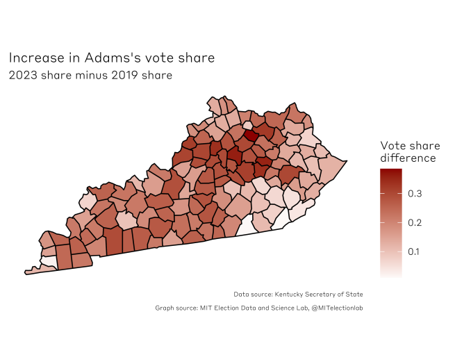
We can visualize similar results geographically, in the below map. This map shows Adams’s 2023 vote share minus his 2019 vote share by county. The darker regions highlight places where Adams saw the greatest differences in his vote share between the two election cycles. As we can see on the map, Adams saw the greatest increases in vote share in the Louisville-Lexington corridor.
Philadelphia, PA
Next up, get ready for cheesesteaks and championship-worthy athletics—our election express train is heading to Philadelphia, Pennsylvania.
This May, Philadelphia held its Democratic primary to elect the next mayor. As a consistently blue city, the winner of the primary is likely to win the general election in November. Incumbent Jim Kenney has reached his term limit, so the candidate field this year was competitive. In the end, Cherelle Parker won after a close fight against several competitors: Jeff Broan, a grocery store tycoon; Allan Domb, a real-estate entrepreneur turned city councilman; Helen Gym, a progressive former councilwoman; and Rebecca Rhynhart, a former city controller.
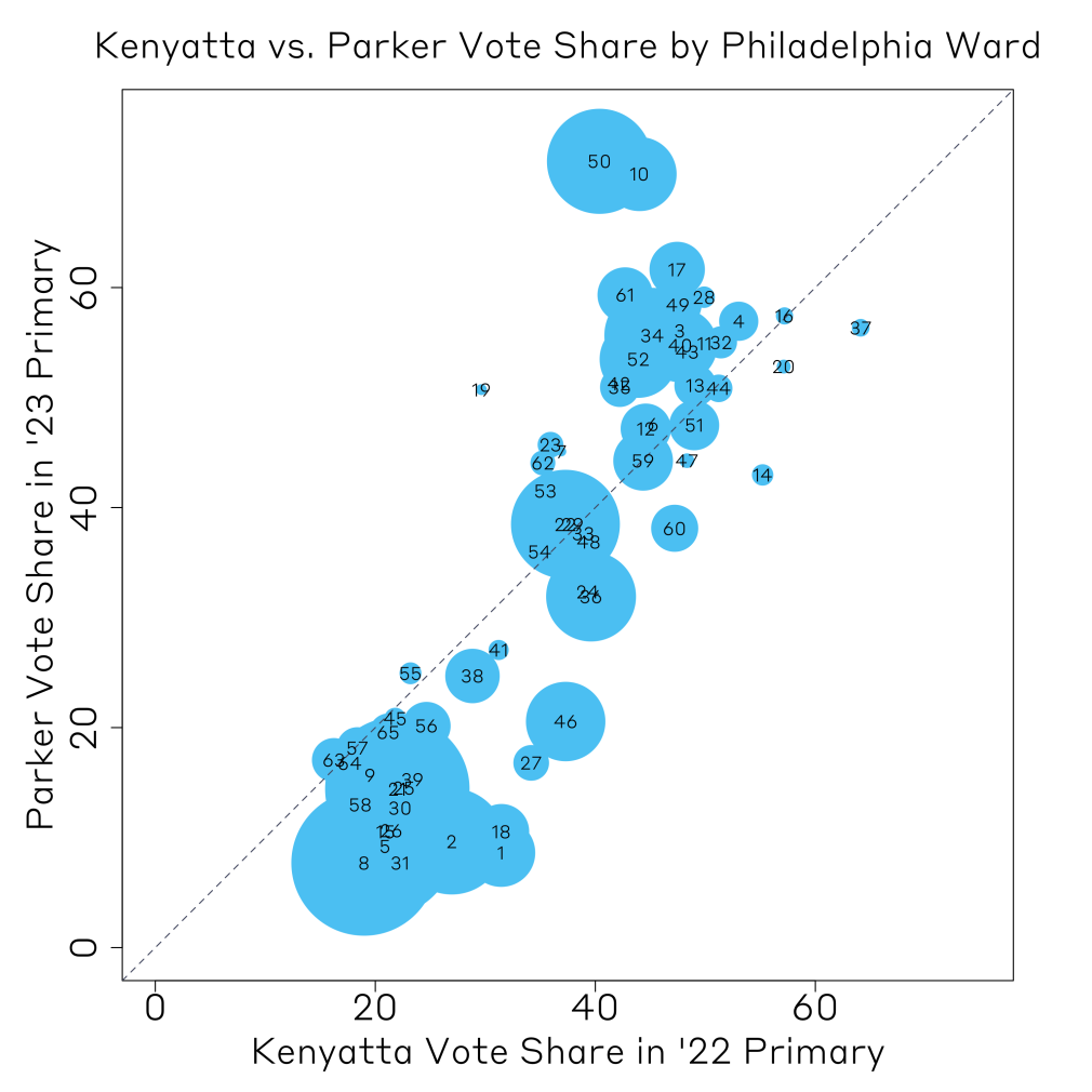
Parker’s policies focused on public safety and economic opportunity– slightly more centrist than other candidates who campaigned for progressive policies, such as prioritizing public education. In this analysis, we look at Parker’s vote share by ward in the 2023 primary and compare it to the vote share for candidates in the 2022 Senatorial primary. The plot below shows Parker’s vote share in each electoral ward against that of a 2022 candidate for US Senate, Malcolm Kenyatta. We are comparing Parker to Kenyatta since they are similar in the sense that the latter is a progressive who despite losing overall in the state performed well in Philadelphia. The points are sized by the population of the wards.
The vote shares between the two elections are fairly correlated. Kenyatta’s policies are more progressive than Parker’s, so at first glance this trend is surprising. However, both candidates are life-long Philadelphians with deep roots in the city. With data from two Democratic primaries– only one year apart– it indicates that Philadelphians feel strongly about electing leadership who have close ties and roots to the city, as opposed to voting strictly for progressive or centrist policies.
Home Sweet Home
Phew, I am exhausted! Just in time, it seems, since we have arrived back home to Cambridge, Massachusetts. Thank you for joining us as we traversed a few of the nation's local contests: a pertinent reminder that US elections don’t take a break just because the year is odd. The results of any of these races can have weighty consequences for local constituents, and even those beyond local and state boundaries.


