Data Visualization and Voter Arrival Behavior Analytics
The MIT Election Data and Science Lab helps highlight new research and interesting ideas in election science, and is a proud co-sponsor of the Election Sciences, Reform, & Administration Conference (ESRA).
James Houghton, Nicholas Bernardo, and Gretchen Macht recently presented a paper at the 2019 ESRA conference entitled, “Data Visualization and Voter Arrival Behavior Analytics.” Here, they summarize their analysis from that paper.
Introduction
In voting, maps are the traditional way to indicate voter turnout or election results with respect to political parties. This paper explores the use of geospatial choropleth maps to analyze vote arrival patterns through a case study of using logs from electronic poll books (EPB) across the state of Rhode Island.
The transaction logs from EPBs record various metrics, including the precinct number, polling location, and a timestamp upon completion for every voter that checks-in on Election Day. To create choropleth maps for the 2018 midterm elections, geographically-referenced jurisdiction datasets are plotted in ArcGIS and combined with the EPB transaction log data for the entire state. The choropleth maps are shaded based on the percentage of total check-ins observed during selected time intervals throughout Election Day.
Our Analysis
This paper seeks to create a methodology to increase the potential use of geospatial mapping beyond presenting aggregate election data. To achieve this, choropleth maps are generated to assist in the visualization of granular election datasets.
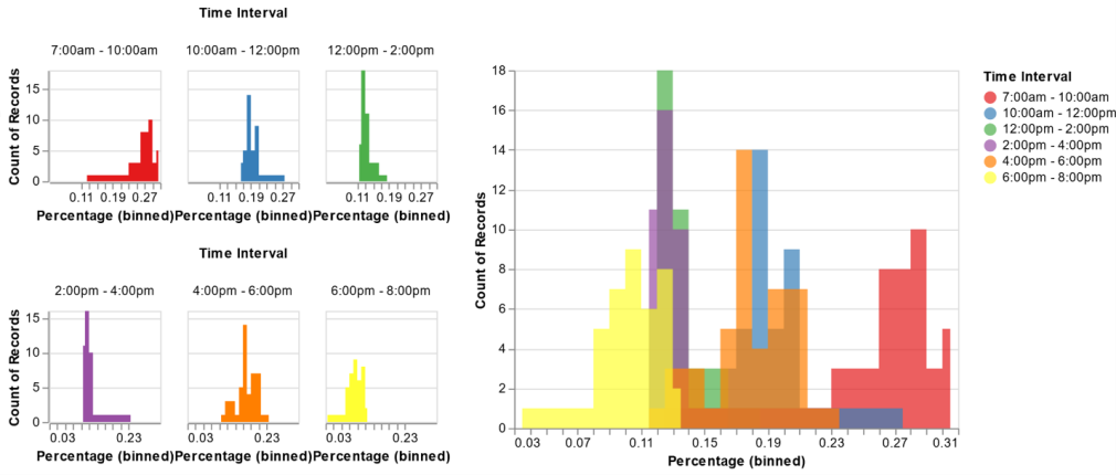
We created two different graphical representations to visualize the relative distribution of arrival percentage rates per time interval. These graphs are used to determine quantity and boundary locations of the discrete intervals used for the initial shading of all six choropleth maps. The first data visualization graphic is comprised of multiple histograms (Figure 1, below). In the left half of Figure 1, the arrival percentages are plotted separately for each time interval, demonstrating the count of precincts that experience each percent turnout for that interval. On the right, a layered histogram is used to combine the individual histograms into a single chart. The axis parameters,
such as scale and domain, are identically defined for all histograms to facilitate direct comparisons between the different time intervals.

Figure 1: Histograms of voter arrival percentage by time interval for the 2018 Midterm elections in Rhode Island
The individual histograms on the left side of Figure 1 show that the greatest variability occurs during the first (i.e., 7:00 am - 10:00 am) and last (i.e., 6:00 pm - 8:00 pm) time intervals. The first and last time intervals also have the highest and lowest mean percentage values, respectively. The 12:00 pm - 2:00 pm and 2:00 pm - 4:00 pm time intervals show the lowest variability with respect to percent turnout and also appear to have similar means. While both intervals have moderate variability and a similar range, it is interestingly noted that the second (i.e., 10:00 am - 12:00 pm) and fifth (i.e., 4:00 pm - 6:00 pm) intervals appear to be skewed in opposite directions relative to their mode values.
The second data visualization graphic features boxplots for the six time intervals (Figure 2). The interquartile range illustrated by the blue box sections is useful when determining an appropriate interval size to use for the shading schema. The horizontal lines shown on either side of the blue
boxes, called whiskers, extend out to mark the 10th and 90th percentiles. The blue circles beyond the whiskers denote marginal outliers that fall within the 5th and 95th percentiles. (Outlier values exceeding this range are not shown.) The relative overlap of the box and whisker sections of the various boxplots are an important consideration when deciding the number of intervals that will be used to shade the maps.

Figure 2: Box Plots of voter turnout percentage by time interval for the 2018 Midterm elections in Rhode Island
Assessing Figure 2, the interquartile range is relatively similar for all but the middle two intervals (i.e., 12:00 pm - 2:00 pm and 2:00 pm - 4:00 pm). The distance between the whiskers’ ends for the 12:00 pm - 2:00 pm and 2:00 pm - 4:00 pm intervals both appear to be less than 5%, indicating a relatively consistent arrival rate for all precincts during those time intervals. The values in the 12:00 pm - 2:00 pm interval appear to be evenly distributed across the arrival rate percentages, whereas the 2:00 pm - 4:00 pm interval’s values appear to be heavily skewed toward lower percentage rates.
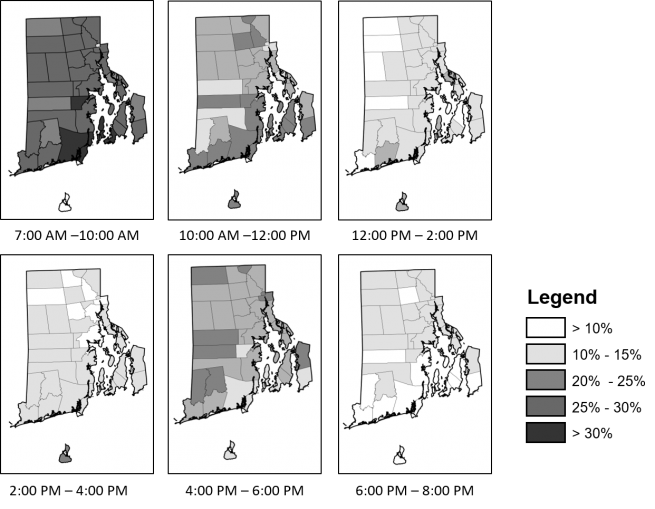
The initial observations from the data visualization graphics were taken into consideration when testing different shading schemas for choropleth map construction. Slight adjustments were made over several iterations before arriving at the final shading schema used to create the series of choropleth maps shown in Figure 3. The use of color was avoided as to not unintentionally imply that the maps display party affiliation information, as well as to make them accessible to those who have difficulty interpreting certain color gradients.

Choropleth maps of percent voter turnout by time interval during the 2018 Midterm elections in Rhode Island
A visual inspection of the choropleth maps (Figure 3) immediately reveals several valuable insights about the arrival behavior of voters in RI’s cities and towns. The choropleth maps confirm the survey-based research findings of Stewart (2015) who identify that peak arrival rates generally occurred early in the morning and steady decline throughout the afternoon. The second uptick in arrivals in the evening characterized by Stewart (2015) can also be seen. However, the timing and duration of increased arrival rate periods vary between cities and towns. In general, the towns along the southern coast peak earlier in the day and steadily decline into the evening, experiencing less than 10% of total voter arrivals between 6:00 pm and 8:00 pm. Although a slight uptick in arrival intensity occurs between 4:00 pm and for some towns, the arrival rate in the second half of the day is lower relative to the rest of the state. For the more rural towns in the western half of the state, arrivals are lower between 12:00 pm and 2:00 pm and higher between 4:00 pm and 6:00 pm relative to the rest of the state. The urban/suburban areas in the eastern part of RI appear to follow the general arrival trend defined by Stewart (2015). The magnitude of peak arrival intensity periods appears to be moderate for the eastern towns and cities.


