Why Does Anyone Need Precinct-Level Election Results?
The MIT Election Data + Science Lab's Precinct Project is one of the lab’s most significant contributions to the field of election science. Every year, members of the full-time staff work alongside undergraduate student researchers to collect, clean, and publish precinct-level election returns for all 50 states and the District of Columbia, and have done so for every major election since 2016. As a result, we have amassed an enormous amount of data that can be very useful for research–within reason.
In a new working paper, “Why Does Anyone Need Precinct-Level Election Results?” (co-authored by myself, Samuel Baltz, and Charles Stewart III), we detail how precinct data can be useful when exploring various political questions. This “primer” will also outline the limitations of precinct data and the situations in which data at this level of aggregation is not useful for conducting certain analyses.
Background
It’s likely that the first effort to collect nation-wide precinct data was by the Record of American Democracy, which contains data dating back to 1984. Precinct-level election data has been used for academic and non-academic purposes alike; for example, political candidates have analyzed precinct data to guide their electoral strategy, and academics have used precinct returns to answer questions about subjects such as geography’s effect on polarization, voter engagement and political participation, and the legitimacy of election results.
Although more organizations are now involved in collecting, cleaning, and publishing precinct data, granular election results still remain quite rare. This is primarily because doing this work presents extensive logistical challenges. In a general election, there are upwards of 10 million unique combinations of precincts and candidates nationwide, so it’s easy to understand how collecting and cleaning this data is a significant undertaking. Further complicating the situation, precinct-level election returns are reported by states or counties, and each locality releases their precinct results at different times. Additionally, there are no standard formatting or naming conventions for precinct data between and/or within states, so information is often incomplete or missing altogether.
Benefits of Precinct Data
One of the biggest benefits of precinct data is that they provide insight into variations at the local level. Just as county-wide or district-wide election results give more precise information than state-level data, precinct data can help explain patterns at a local level with much more precision and nuance than data at a higher level of aggregation. As the table below demonstrates, a significant amount of local data are lost if one just uses county-level election data in their analysis.
The table shows a rough estimate of the total number of office-county-state name combinations in MEDSL’s precinct data for the given years compared to the number of office names only contested at the precinct level (the share of sub-county races not contested at the precinct level trends down over time, but this is because less local data was collected in 2018 and 2020).
| Year | Total Office-County-State Combos | Combos Only Contested at the Sub-County Level | Sub-County Share |
| 2016 | 43,856 | 18,209 | 42% |
| 2018 | 46,227 | 9,746 | 21% |
| 2020 | 30,747 | 4,269 | 14% |
Data source: MIT Election Data + Science Lab.
Even so, looking at 2018, someone would miss about 1 in 5 of the office categories contested in each county if they used data at a higher level of aggregation as opposed to precinct data. It’s worth noting that this table reports the number of distinct office names at the county and sub-county levels as opposed to the actual number of contests present in the data. The table above is provisional; keep an eye out for the precise estimates in our paper.
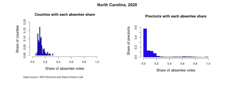
Another instance in which precinct data can be useful is when one is interested in exploring geographic variation in the distribution of vote modes. As an example, let’s compare the share of absentee votes across all counties in North Carolina in 2020 with the share of absentee votes across all North Carolina precincts.
These graphs tell an interesting story. The county spread is on par with expectations, with the majority of counties having an absentee vote share of between 10% and 20%. However, the precinct distribution depicts a different spread, and there’s a specific reason for that: the small bar on the far right indicating precincts that have an absentee vote share of 100% actually represents non-geographic precincts that counties in North Carolina have designated to “hold” all of the absentee votes in those counties (in the data, those precincts are given the name “absentee votes” or something similar). This in turn exaggerates the share of precincts with a low percentage of absentee votes, represented by the large bar on the far left.
While in this case the precinct distribution has been skewed, the data still provide valuable insight into the variation in vote mode across North Carolina precincts. This example demonstrates the importance of being aware of external variables that may be driving extreme values, like the creation of non-geographic precincts in this case.
Limitations of Precinct Data
There is one primary limitation of utilizing precinct-level election returns: it is difficult to use them to observe how patterns change over time. This is simply because precinct boundaries are not static, and when precinct boundaries change, the number of voters, partisan makeup, and other characteristics within precincts change as well.
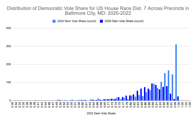
To demonstrate this, the graph below shows the difference in Democratic vote share in US House Race Dist. 7 across all precincts in Baltimore City, Maryland for 2020 and 2022. The city underwent re-precincting (the process of creating, abolishing, and/or redrawing precinct boundaries) between those years, and this likely accounts for the majority of the change we see in the vote share. In particular, there is a large difference in the number of precincts that have a Democratic vote share between 94 and 99%. Of course, it's possible that other factors were contributing to this significant increase over time, but the majority of the change was most likely simply due to boundaries changing.
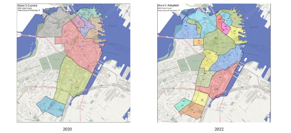
As another example of how redrawing boundary lines can affect precinct analyses, The image below shows aerial views of Boston’s third voting ward for 2020 and 2022. The map on the left shows the division of precincts within the ward in 2020 and the right map shows how it looks presently after having undergone re-precincting in 2022. The ward had 8 precincts in 2020 and more than doubled to 17 in 2022; it would not be useful at all to do any sort of longitudinal analysis at the precinct level in this case.

Data source: City of Boston Board of Election Commissioners (Oct. 20, 2021).
Something important to be aware of when working with precinct data is the ecological inference problem (also sometimes called cross-level problem). This is a common issue where a researcher is interested in behavior of a certain population but only able to gather data at a higher level of aggregation; as a result, that data must be used to make inferences about the population of interest. To demonstrate how there are often discrepancies at the county and precinct-level election data, we can explore the relationship between partisanship and race in North Carolina in 2020.
We’ve created two scatterplots below; the left side shows the distribution of the share of white Democratic voters across all counties in North Carolina in 2020, and the plot on the right shows the same information but for the precincts within Wake County, one of the state’s largest and most heavily-populated counties. The spread looks fairly similar between the two, but if someone were to use county level data to try and make inferences about race and partisanship at the precinct level, they’d be missing out on some important nuance (such as the large cluster of localities that are majority white but only about 50% Democrat). The county data makes it appear that it is more common for heavily white areas to be more politically polarized.
All in all, precinct-level election data is extremely valuable and can be in service of a wide variety of undertakings in the election community. However, it’s important that scholars and practitioners are also aware of its limitations as well as external variables that might be contributing to certain outcomes. For this reason, using data at a lower level of aggregation isn’t always the “better” choice. Precinct data just allows one to investigate political phenomena in a specific way, and the benefits of doing so hopefully make the case that efforts to collect, clean, and publish precinct data are worth supporting.


