While the everyday voter may not give it much thought beyond looking at their own ballot, the way ballots are designed can dramatically affect voting behavior, and in the most extreme cases, even influence election results. Good ballot design is also crucial to ensure elections are accessible to all voters; seemingly simple choices can have an outsized impact.
This explainer was last updated April 28, 2023.
Who is in charge of designing ballots?
The 10th Amendment of the U.S. Constitution gives states power over non-federal election administration. Federal and state-level agencies (including the Election Assistance Commission) and organizations (most notably the Center for Civic Design) can and do provide assistance, especially as ballot design flaws have garnered increasing public attention in the last two decades, but in most jurisdictions, ballot design is the purview of local election officials. In many ways, local control is beneficial, as election officials can consider the specific needs of their communities and tailor their ballots to fit. However, good intentions alone can often have adverse, unintentional effects when other design considerations aren’t taken into account.
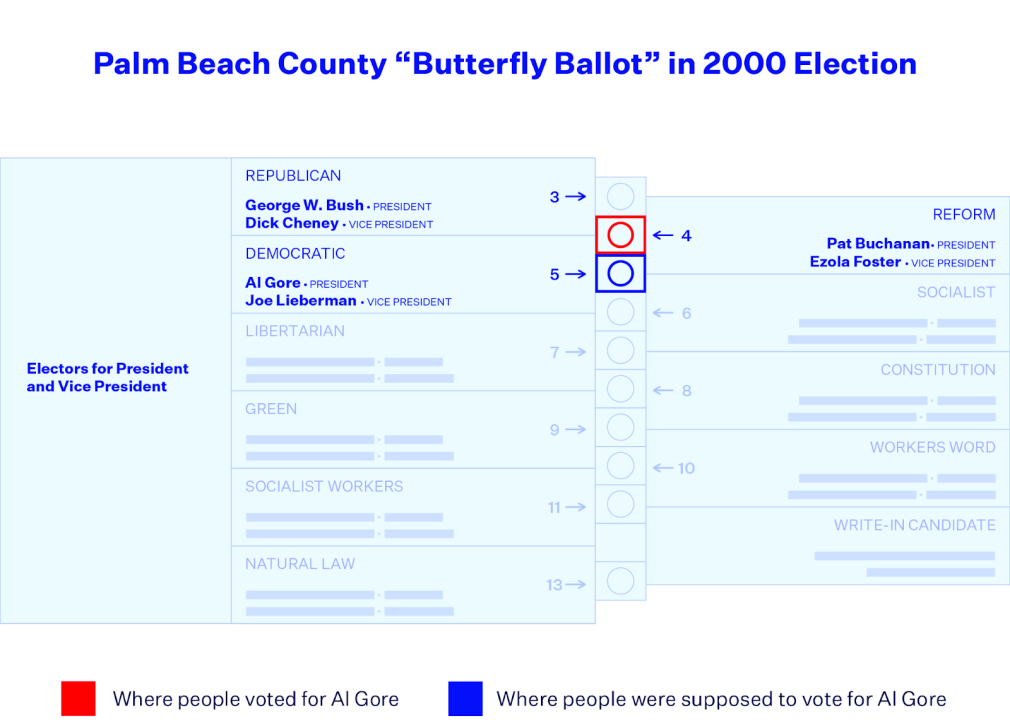
Take the infamous butterfly ballot from the 2000 presidential election as an example. This ballot had been intentionally designed by Palm Beach County, FL to have bigger font that was easier to read, with the aim of helping the county’s large senior citizen population. To accommodate the larger print, the list of presidential candidates had to be spread across two facing pages and the markers interlaced, which caused confusion for some voters about where to punch to indicate their preferred candidate.
As Wand et al (2001) summarize in an article for The American Political Science Review, it was eventually determined that this poorly designed ballot in one single county likely cost Al Gore the presidency, after George W. Bush won the state of Florida by a razor-thin margin of 537 votes. The image above shows the layout of the Palm Beach butterfly ballot. The Palm Beach Post’s reporting found that several thousand voters who cast a ballot for Gore, the Democratic nominee, also punched the holes directly above or below, which corresponded to the Reform or the Socialist Party’s nominees, respectively—an over-vote error which invalidated their ballots.
Common Ballot Design Pitfalls
Poor Organization
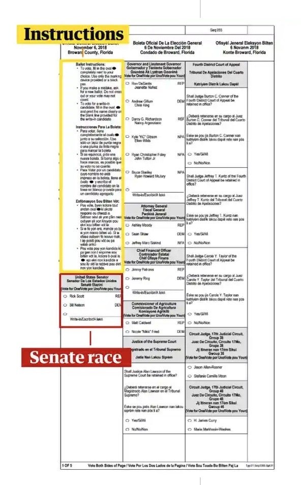
One of the most common ballot design flaws is placing information in a way that impedes how easily a voter can navigate the ballot. For example, placing a race in certain areas may make it more likely that voters will unintentionally skip over it. This happened in Broward County in 2018, where the candidates for that year’s U.S. Senate race were listed directly below the ballot instructions, separated from the other races on the ballot.
This led to a 9% drop in the number of voters to vote on that particular race compared to other counties of the same congressional district that used different ballots. This poor design choice likely disadvantaged more experienced voters (aka “rushers”) who rushed through the instructions and skipped over the first column as well as low-literacy voters (or “skippers”) who were more likely to just read the top of a paragraph and decide whether to continue.
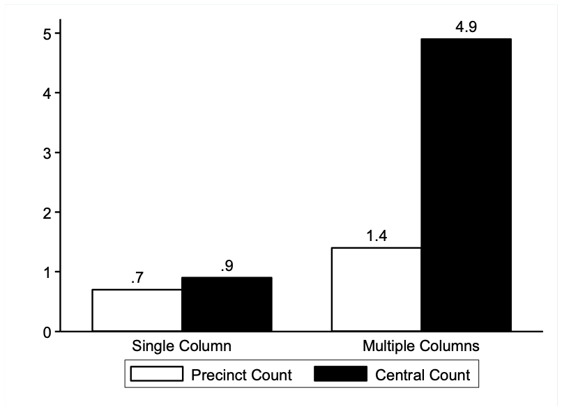
Poor organization of the ballot can also encourage overvoting (voting for more candidates than is allowed). California held a special election to replace retiring U.S. Senator Barbara Boxer in 2016, and 34 candidates ran for the seat. This presented quite a challenge for county election officials, for they had to design ballots to accommodate such a large number of candidates while also ensuring readable fonts and ballot order protocol. Bilingual ballots presented an extra challenge, constraining the number of candidates that would fit on a ballot page even further. Therefore, the majority of counties opted to split the content into two columns, and this caused significant confusion for voters who were used to marking one name per column. After the election, it was determined that over 2.8% of ballots were thrown out because they contained overvotes for the U.S. Senate seat. Political Scientists David Kimball and Martha Kropf found that the overvote rate in counties that split the contest into two columns was 3.4% and the counties that opted for a single column was 0.8%.
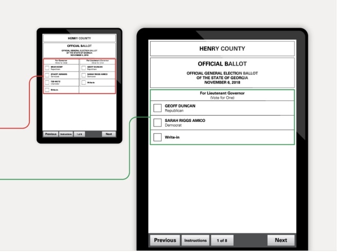
Another example of poor navigability can arise for electronic ballots that list multiple contests on the same screen. This leads voters to miss more questions than if each contest is displayed on its own. This is a basic principle of interface usability: people are far less likely to miss questions if they are asked one question at a time and proceed to a new screen only after they have answered the previous question. This principle is standard for a wide range of digital use cases, from ATM machines to online surveys.
In the 2018 midterms, some ballots in Georgia displayed candidates for lieutenant governor on the same screen as other contests. As a result, four percent fewer votes were cast for lieutenant governor than for governor, and 2.7 percent fewer votes were cast for lieutenant governor than for secretary of state. That represents over 100,000 lost votes for lieutenant governor in a contest where the margin of victory was just over 123,000 votes.

Image source: Oxide Design Co./Brennan Center for Justice at NYU Law.
Complex Races
Intuitive ballot design is especially important for elections that use instant runoff voting, simply because the process may be less familiar to voters. Instant runoff ballots have been designed in many different ways, but two of the most common formats use either an oval grid or columns with arrows (see below for examples of both formats).
Recent research from the Ranked Choice Voting Resource Center on the effects of ranked choice ballot design found that using arrow-column ballots led to more errors than column-grid ballots, and that the rate of these errors increased as more candidates were added. To be precise, the Center found that arrow ballots lead to a 0.47-percentage-point increase in the error rate compared to oval ballots. To put this into perspective, an election with roughly 200,000 voters could expect that arrow ballots would lead to an additional 940 ballots being uncountable due to error.
The good news is many localities that previously used arrow ballots for RCV elections have since abandoned them in favor of more intuitive grid and column ballots. However, non-RCV races where voters mark preferences for different numbers of candidates tend to cause confusion as well. Examples include races where there is more than one seat to fill, such as many district and city council races. In such cases, it is crucial for information regarding how many candidates one can choose to be made abundantly clear, and it is helpful for electronic ballots to keep track of how many preferences a voter has ranked as they fill out the ballot.
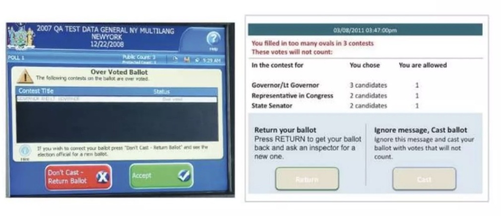
Source: "Defects by design: Ballots that fool voters" from Center for Civic Design.
Confusing Details
Deceptively simple details like font type, font size, and paragraph alignment also present issues for ballot design. These elements make a huge difference in a voter’s ability to navigate a ballot. For instance, the Center for Civic Design recommends using lowercase letters, avoiding centered type, and using one cohesive font type and size. These changes make it less likely that a voter will skip information, following design best practices learned in other industries:
- Sentence-case (that is, using both upper- and lower-case letters) is more legible than all-capital letters since it makes shapes that are easier to recognize.
- Left-aligned type is easier to read than centered type, which forces the eye to hunt for the start of the next line.
- Using only one font makes the ballot more unified, while different fonts force voters to stop reading and adjust.
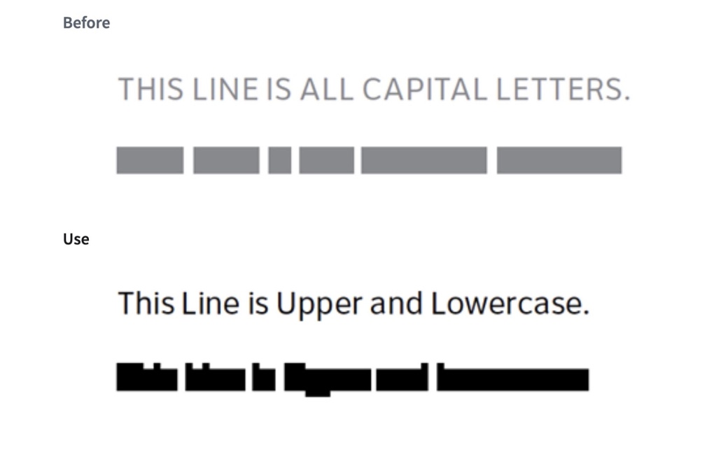
Image source: Center for Civic Design, 2022
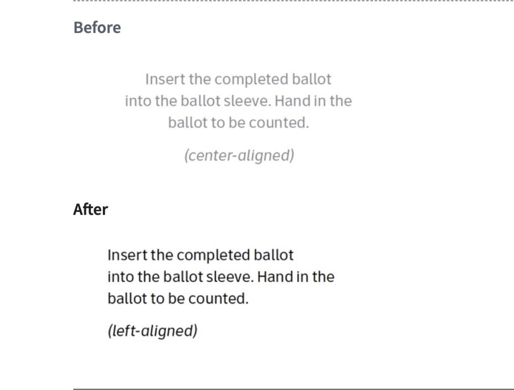
Image source: Center for Civic Design, 2022
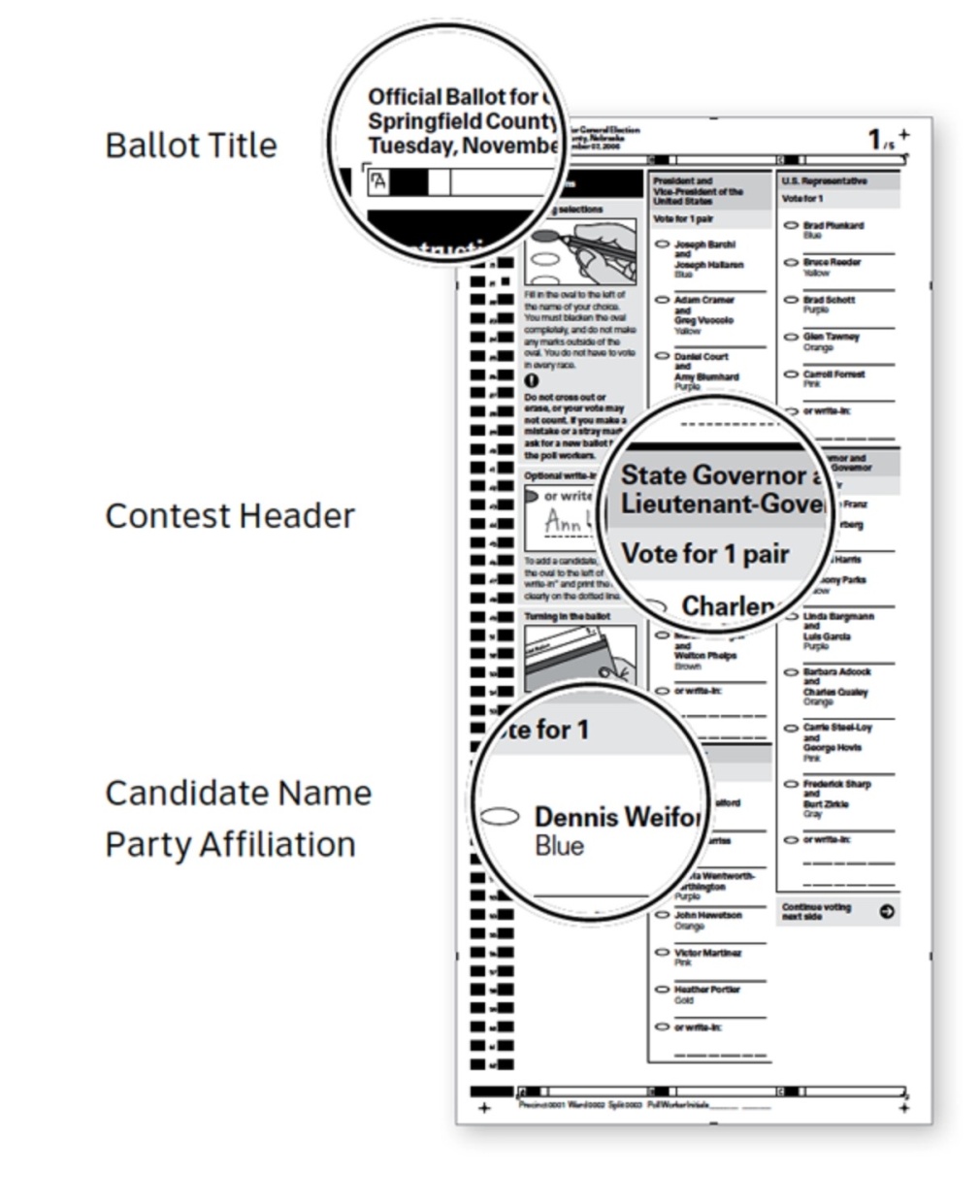
Other, similarly small-sounding adjustments can be used to create a clear information hierarchy—a critical tool that helps voters navigate a ballot. This means, for example, making the title of the ballot the most prominent thing on the page, followed by the contest headers, and making candidates’ names bolder than their party affiliation.
Likewise, visuals can be extremely helpful in maximizing ballot navigability, especially for low-literacy voters—but done poorly, they can create more confusion than they resolve. The placement, purpose, color, and shading of illustrations can all affect whether a ballot’s visuals are a help or hindrance; this holds true for paper and electronic ballots alike.
Absentee Ballots
These ballot design principles extend to absentee ballot envelopes as well. This has become more important than ever in recent years, as an increasing percentage of the electorate is voting by mail. In many cases, ballot envelopes are covered with required information, which can lead to confusion and errors. It is even more critical for election officials to ensure absentee ballots have clear and obvious instructions for voters, because the voter will not have someone on hand to clarify or troubleshoot potential issues.
Signature verification is a common security measure states use to ensure mail ballots are cast only by eligible voters. Where signatures are required, ballots with incorrectly placed or wrong signatures make up a significant percentage of those that are sent back to the voter to be cured, or in some states, simply thrown away. This caused issues during the 2018 midterm elections in Gwinnett County, Georgia, where a confusing ballot envelope led the mail ballot rejection rate to skyrocket.
The county’s absentee ballots that year did not have an “X” or box to draw attention to the signature line, and the instructions below the signature line read “Signature or mark of elector,” causing confusion with many voters who were not familiar with the term “electors” or did not think of themselves as an elector. The envelope’s language format was also inconsistent. While the English- and Spanish-language voter oaths were placed vertically, one on top of the other, the English and Spanish oaths for the “person assisting elector” were placed side by side. Ultimately, a report conducted by the Brennan Center found that the county rejected a total of 1,690 mail-in ballots ― 21 percent of those rejected in Georgia during that election ― even though Gwinnett County accounted for only 10 percent of the mail-in ballots submitted in the state.
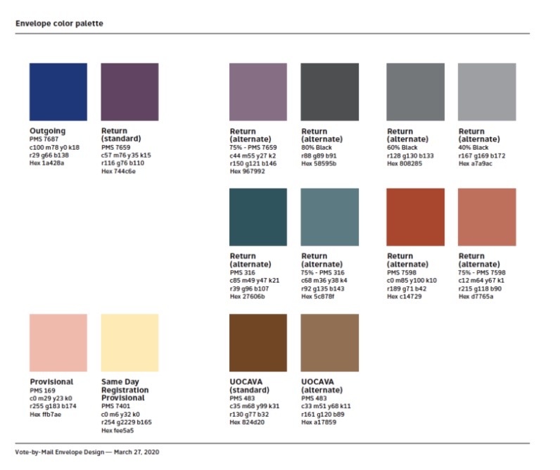
Election officials continue to work on issues like these, often in collaboration with organizations and experts who study the intersections of behavior, user experience, and design. The Center for Civic Design, for example, has collaborated with the U.S. Postal Service to design ballot envelope templates that are more intuitive for voters to use. An example of one of the envelopes is shown below: in it, we can see that the signature line is clearly marked, and there’s a checklist to ensure voters have completed all of the necessary steps to get their vote counted. This kind of intentional design can also make election officials’ jobs easier: the suggested color palette in this template, for example, not only meets the official ADA requirements for accessibility, but also helps election workers sort and process votes accurately and efficiently.
Takeaways
Generally, the idea of accessibility in voting is associated directly with ADA-compliant polling places or language accommodations, but ballot design also presents a significant accessibility issue. Ballot design has a direct effect on voting behavior, and can ultimately determine whether or not a vote will be counted at all. In the most extreme cases, poor ballot design can be an unintended factor affecting the results of a competitive race, as with the presidential election in 2000. But even in less dramatic circumstances, ballot design can affect voter satisfaction, disenfranchisement, and the difficulty of election officials’ work.
The good news is that ballot design on the whole is improving. Local election officials have begun investing more resources in ensuring that ballots are more easily accessible, a concerted effort that wasn't as prominent even a decade ago. An example that illustrates this well is the mail ballots implemented in 2018 by LA County. In previous years, voters had to look up candidate names in a guide and then hunt for a corresponding number on the ballot, but this multi-step process has been replaced with a simple procedure where voters fill in the oval next to their preferred candidate. These ballots also included prepaid postage, eliminating yet another barrier to voting absentee.
Reputable guides like the one from the Center for Civic Design and the AIGA have never made it easier for ballot designers to make sure voters cast ballots as they intend. States that have been making ballot design a priority will hopefully set an example for effective practices that will eventually be more widely adopted.

